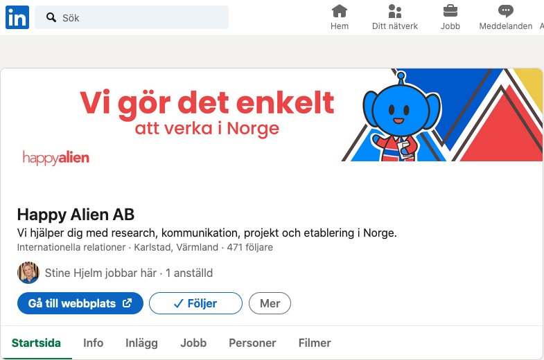
My internship at Happy Alien

Hi!

I’m currently doing my first internship at Happy Alien and thought it would be a good idea to show and tell the design process of the content that has been published (while it’s relatively fresh in my mind).

My role at Happy Alien is to provide visual content such as banners, illustrations and videos for the LinkedIn page (and website). The goal is to build a brand identity and attract engagement. Since I have interest in animation, I asked if I could create those as well.

Programs I’ve used:

Illustrator, After Effects, Premier Pro, Animate, Photoshop, Procreate, Figma & Canva.

Getting started

Before I began making anything, I asked my supervisor Stine what I can help with and who the competitors are, so I could make sure the current graphic profile match the brand we’re going for and stands out. I also asked for three key words the company stands for, to further emphasize them throughout the designs.

An addition, was a mascot that could be used as a guide. I’m very glad Stine wanted a mascot, since it gave me a lot of practice to use simple shapes to build a character and create stories that are connected to Happy Aliens services!

This is Happy.

The logotype and colors (except for yellow) were already decided, so I made sure to consistently use them for a coherent look. My supervisor is not a designer, so I have to independently solve design problems when they appear, but luckily, it hasn’t been anything that google couldn’t help me with, haha.

Banners and animation

Initially, Stine wanted me to edit videos she recorded when I wasn’t making banners and cards. As for now, most of my energy is making animations in After Effects and Animate.

Happy Alien is expanding its services, so we decided to have a Swedish character (Eli). That’s why we included yellow.
Sketch from storyboard with Eli as a commoner (without the Swedish flag on their shirt)
LinkedIn banner
My supervisors LinkedIn account

Here are a few pictures of the storyboard I made for the “Bad Norweigan translations” animation. The process simplified:

  • I recieved translation examples + explainations.
  • I wrote a script based on the examples + storyboard.
  • Show and discussion the message.
  • I make it in Illustrator and After Effects.
  • Feedback.

One scene from the animation. The final result can be watched here.

Video

As for videos, I taught myself to use Premier Pro through tutorials. The videos were recorded by Stine talking about various topics related to business in Norway and Sweden, so my job was to edit the final product. I also added subtitles which were provided from a script. Video can be watched here.

Summary

During my internship, I made visual content to build a brand identity and attract traffic to Happy Alien’s LinkedIn page. I’ve learned to edit videos with subtitles and created animations from scratch to final product.

I feel very fortunate to be allowed the freedom to create content while learning new things along the way! I’m not good with numbers and analytics, but the content is making an improvement to the LinkedIn page, which is great! πŸ˜€

Christmas Project – UHRF Logotype Finished

Hello! I finished the logotype yesterday and this is the final result! πŸ˜€ The last thing to decide was the alternative color scheme when the logotype isn’t black or white, since the client wanted to include some colors. However, to keep the logotype simple and modern, I decided to keep the primary version black without a border.

Below are the tests I tried based on my clients choice of colors. I also added borders with different roundness to play around with the idea if the logotype was a sticker. My client prefered round corners, so I went with that. As for the color choices, it did not seem fit to use any of them since the contrast was either to vague or strong to the eye and did not reflect their brand. Instead, I went with a darker green (growth & health) and orange (energetic and fun). As the primary colors when its not black or white. I also did not want to use white since the client wanted their brand to feel “warm”. Therefore, a warm yellow was used in combination with the colors to look more organic, rather than artificial.

As for the keypoints I promised my client to correct:

  • Shorter name for easier recognition
  • Modernize the logotype
  • The logotype is visible from a far distance

As designer’s we never truly feel “done”, right? But I’ll savour the feeling of completing my client’s goals and someday look back at this design to see what further changes I could do! But for now, I’ll take a break and enjoy my holiday.

(We’ll see if I end up making a webbdesign, but for now I want to drown in netflix and watch series haha)

Christmas Project – UHRF Name change and logotype sketches

Hello! I’m back to update my process of the brand name change which I made some sketches for the new logotype. Since the original name “Ultimate Health Real Food” is too long, I suggested a shorter name that is also targeted towards a Swedish audience which is the current users of the service.

Since ultimate is spelled ultimat in Swedish, I though of using “UltiMat” as a double meaning in Swedish which is Ulti + Mat (literally meaning: ultimate food). The client is also found of puns, so they were pleased with the new name. By using “UltiMat”, the brand name is shorter, easier to remember and hopefully able to reach out its message as a brand that wants to help people acquire ultimate health (by eating healthy food).

After deciding the name, I sketched logotypes that include keywords such as “ecological, plantbased and food”. In Sweden, we care about the environment so the client wanted an environment friendly spin on it, so I added “recycle”.

Since UltiMat is recommending a plantbased lifestyle, I chose to use a leaf as the primary symbol in most sketches. The client gave me free hands to design as I seem fit, but I still wanted to make sure we were on the same page by asking if they had anything specific in mind I should include in the sketch process. Before deciding which design to make into a proper logotype, I asked the client which design they thought represented their brand the best.

The final sketch that will turn into UltiMat’s logotype πŸ™‚

I did not base my sketches of any existing font, so the next step is to look for serifs in low contrast and sans-serifs fonts. I will also experiment with different thicknesses since the client wants the logotype to stand out.

That was all for the name change and design sketches process! Although it went quickly to come to the final stage of the logotype, I feel very happy that I managed to be productive and not overdo it!

The next post will include the final result and maybe future plans to make a webbdesign on desktop and mobile for UltiMat’s services.

Merry Christmas and a Happy New Year to you all! πŸ˜€

Christmas Project – Improve “Ultimate Health Real Food”

Hello! Although I’m back home for Christmas holiday after a rough semester at school, I will attempt to improve the brand “Ultimate Health Real Food” during my freetime. My plan is to first make it easier to remember the brand name, by shortening it and later create a logotype that reflect its services and values.

fun fact, The logotype below is my creation from 10 years ago and tbh, I feel very excited to make something much better since I did not have the same thinking process as I do now.

Bonus: I would love to come up with a webb & mobile friendly design for its various services if I got the time as well. After all, this is my precious time for relaxation, so I will do my best to not overdo it.


Before I get started sketching some ideas, I’ll provide a little background information about the company “Ultimate Health Real Food” and talk about their goals.

Background and plan

The company’s purpose is to inspire people of all ages and genders to eat healhy as a lifestyle, rather as a diet. By providing recipes that are tasty, vegan and environment friendly, the goal is to make people eat healthy food that is scientifically proven to improve anybody’s health long term.

The problem and/or struggle customers has, is bad health that can be cured by eating healthy and/or lack of finding healthy recipes that tastes good.

The client’s ambition:

  • Reach an international target audience
  • Direct their services to people of wealth
  • Provide recipes and premade meals tailored to each customer

Reality:

  • Target audience is primarily Swedish women between the age 25-50.
  • Customers do not commit to the recipes tailored to their needs due to lack of time
  • The client cannot prepare premade meals due to high cost and lack of time

With this gathered information, I will make a moodboard on Pinterest to set the tonality of the brand and look for inspiration.

If I end up making the webb and mobile design, I might include competition resarch as well! πŸ™‚

But for now, I’ll continue to cuddle with the dogs that have fallen asleep on me haha.

Process: Triumf re-brand logotype

Hello! School has been busy and I never managed to update about the final product of the rebranding logotype assingment until now, so here I go!

First of all, this is the final result. πŸ™‚

I made this in Illustrator and had three keywords in mind when I sketched the various ideas on paper.

  • Summer
  • Playfulness
  • Modern design

Sadly, I did not save the sketches I drew on paper, so I can’t show them. But I rememeber that I made various shapes like squares, circles and triangles with waves/a sun/stripes going in different directions. I also tried to use negative space to make ice cream shapes. But in the end, the feedback was to not stray away from the original shapes which are a rectangle and a wave.

For my design, I decided to round the corners and remove excess details to make it look more modern. To add the playfulness and summer vibe, I increased the size of the wave and wanted to introduce some sharper shapes to balance out the roundess of the rectangle and typography. I also used a slightly deeper shade of yellow and orange, to make the logotype look less pale.

As for the tools I used to create the logotype in Illustrator, it was mostly the rectangle tool (M), shape builder tool (shift+M) and Pen tool (P).

If you want to check out the secondary and negative version of the logotype, check it out on Behance —> https://www.behance.net/gallery/107647663/Triumf-glass-re-brand-logotype πŸ™‚